The power of a curtain's color extends far beyond a simple aesthetic choice. It is a design decision that fundamentally impacts the mood, energy, and perceived scale of a room. An expert designer doesn't choose a color simply to match furniture or the walls - they consider the room's purpose, its existing palette, and its desired feeling all at once.
This guide aims to help homeowners consider how to use curtain color to curate the perfect home environment, moving beyond simple rules to a deeper understanding of integrated design.
The Integrated Color Palette: Harmonizing Hue with Function and Style
An expert designer's process begins with a single question: what do you want this room to feel like? The answer dictates the color, which is then woven seamlessly into the existing decor.
The Dependable Palette: Neutrals
Neutrals are the most powerful and versatile tools in a designer's toolkit. Far from being "safe" in a boring way, they are the key to building a timeless, sophisticated, and flexible home. The expert's use of neutrals considers its undertones, its relationship with light, and the mood it creates.
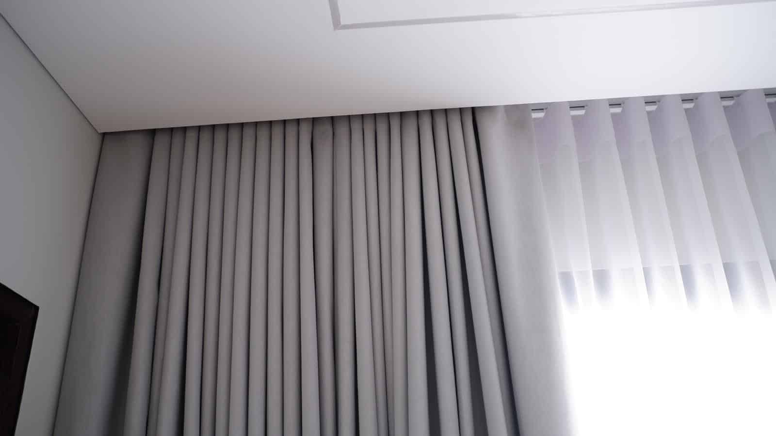
- Whites: A true white can make a room feel expansive, clean, and minimalist, but its coolness can sometimes feel sterile. For a softer, more inviting feel, opt for an off-white or cream with a warm yellow undertone. These shades still offer the brightness of white but bring a subtle glow that pairs beautifully with natural wood and creates a cozy, cottage-like charm.
- Greys: Grey has become the new neutral, a sophisticated and modern alternative to beige. However, not all grays are created equal. A cool grey with blue undertones can make a room feel sleek, crisp, and serene, pairing perfectly with modern, metallic decor. In contrast, a warm grey, with a touch of beige, offers the sophistication of grey with the warmth of a neutral, making it one of the most versatile and popular choices for a grounded, comfortable home.
- Beiges: Beige has a rich and earthy quality. A light sand or linen beige can evoke a coastal feel, making a room feel light and breezy. A deeper camel or tan offers a rich, warm tone that can be used to anchor a traditional or rustic space, providing a feeling of comfort and timeless elegance.
When a designer would choose this palette: A designer chooses neutrals when the goal is to create a timeless foundation that can adapt to changing decor trends. They are the ideal choice for spaces where the furniture, art, or architecture should be the focal point. For instance, a designer working on a rental property or a home to be sold would use neutrals to appeal to the widest audience. A minimalist or Scandinavian-style interior with light wood floors and clean lines would be incomplete without the calming simplicity of a crisp white or light greige curtain.
The Serene Sanctuary: Cool Tones
When the goal is tranquility and rest, the palette should reflect it. Cool tones - blues and greens - are the workhorses of calm. Their psychological effect is so potent that they are widely used in professional environments designed to promote relaxation, such as spas and hospitals.
- Blues: From the serenity of a soft sky blue to the deep, calming authority of a navy, blue is the ultimate color for rest. A light, dusky blue offers a sophisticated, almost-grey alternative that feels both peaceful and modern. A vibrant cerulean can add a touch of cheerful energy without being overstimulating, while a comfortable denim blue works beautifully in casual, farmhouse, or coastal-style homes, pairing effortlessly with rustic wood and soft linens.
- Greens: The color of nature and growth, green brings the outdoors in, reducing stress and promoting a sense of well-being. A soft sage green or moss green is incredibly versatile, working with both warm and cool palettes. A muted eucalyptus green offers a slightly grey, spa-like feel, perfect for a relaxing bathroom or a peaceful bedroom. For a more subtle touch, a very light, almost-white pistachio green can add a hint of color that feels fresh and airy.
When a designer would choose this palette: This palette is the first choice for bedrooms, nurseries, and home offices. A designer creating a coastal-style bedroom with white walls and a rattan bed would choose soft, dusky blue curtains to evoke the feeling of the seaside and promote rest. For a home office that receives a lot of sunlight, a muted sage green curtain would be chosen to create a tranquil, focused environment that reduces eye strain and helps keep the room from feeling overheated.
The Energetic Hub: Dynamic Hues

For rooms where people gather, talk, and engage, like living rooms and dining rooms, the palette can be more dynamic. Here, color is used to stimulate conversation, create a feeling of welcome, or add a pop of life.
- Yellows: A shot of yellow is like a dose of sunshine. A vibrant lemon yellow can bring a playful, energetic touch to a kitchen or sunroom, but a more sophisticated mustard yellow or goldenrod creates an elegant, vintage feel that pairs beautifully with warm woods and neutral backdrops. In a room that lacks natural light, a buttery yellow curtain can create the illusion of warmth and sunshine even on a cloudy day.
- Oranges: As a high-risk, high-reward color, orange requires careful consideration. A vibrant mandarin orange can be overwhelming, but a more muted shade can be spectacular. A deep terracotta or rust orange is a sophisticated choice that feels earthy and warm, working beautifully with palettes that include olive green, deep brown, and warm wood. This shade can create a cozy, intimate feel in a living room, especially when balanced by a foundation of cool greys or dark blues.
When a designer would choose this palette: A designer turns to warm tones for spaces meant for entertaining and socializing. To make a modern living room with a neutral gray sofa feel more inviting, they might introduce curtains in a sophisticated mustard yellow to add a pop of color and warmth. In a dining room with exposed brick or deep wood furniture, a deep rust-colored curtain would be chosen to amplify the existing warmth and create a cozy, intimate atmosphere perfect for long dinner parties.
The Curated Statement: Unconventional Colors
Sometimes the goal is neither calm nor energy, but a specific aesthetic statement. This is the advanced stage of curtain color choice, where the curtains are used to create a feeling of luxury, drama, or minimalist art.
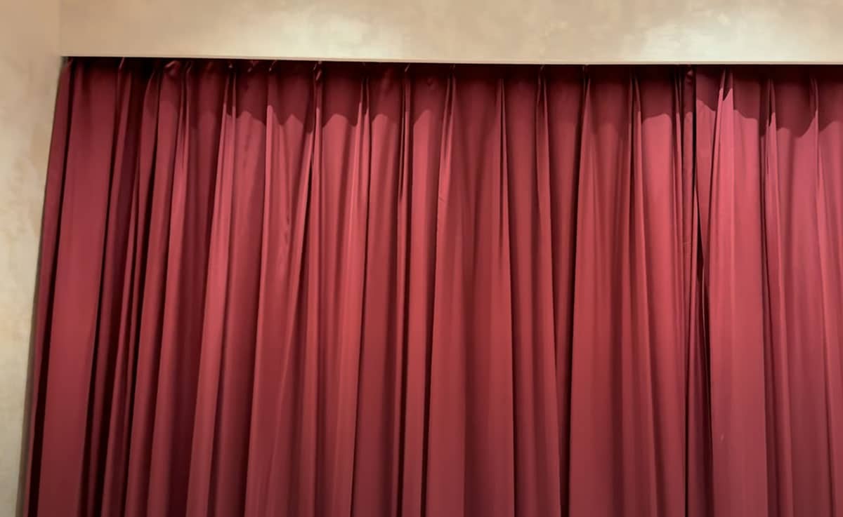
- Reds: Red is the color of passion and power. While a fiery scarlet red can make a bold, modern statement, a deep merlot or burgundy evokes the richness of classic theater curtains and formal dining rooms. These deep shades are perfect for spaces where you want to create a sense of intimacy and opulence.
- Purples: The color of royalty and luxury, purple can be both calming and dramatic. A soft lavender or lilac can add a gentle, romantic feel to a bedroom, while a deep aubergine or plum creates a truly regal and sophisticated statement. These shades pair beautifully with metallic accents like gold and brass, enhancing their opulent feel.
- Black: A choice that seems counterintuitive, black is a powerful anchor. A heavy black velvet curtain can make a room feel incredibly luxurious and dramatic, while a simple black linen or cotton curtain works wonders in a minimalist or industrial space, providing a sharp, clean line that defines the room. Black is the ultimate high-contrast choice, especially when paired with white walls, and is the most effective color for complete light blockage and insulation.
When a designer would choose this palette: A designer chooses these bold colors when working with a client who wants a dramatic, high-impact space and a specific interior design style. For an Art Deco-inspired study, they might use deep plum velvet curtains to complement a brass desk and rich wood paneling. In a minimalist, industrial-style loft, black linen curtains would be chosen to create a striking contrast against white walls and concrete floors, turning a simple window treatment into a powerful architectural statement.
Finishing with Fabric, Texture, and Style
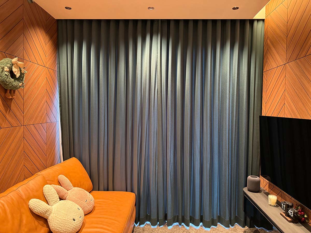
The color itself is only part of the story. The final layer of expertise comes from how that color is expressed. The fabric and texture of the curtain directly influence the mood. A rich color on a heavy fabric like velvet will create a feeling of luxury and drama, perfect for a traditional or Art Deco-inspired space. The same color on a light, breezy linen will feel casual and modern, ideal for a bohemian or farmhouse aesthetic. The opacity of the fabric dictates the light. Sheer curtains in a soft color will create a gentle glow, while a rich color on a blackout curtain will be fully realized, adding depth and saturation to the space. Finally, the curtain's style, from pleated curtains to S-Fold curtains, must also be in conversation with the overall design, ensuring every element works together to create your perfect home.
